Assignment I
Designing a visualization
The use of visualization is pervasive in the media: explanatory diagrams in magazines and textbooks, graphs describing statistics and budgets, images showing spatial layouts of objects, new experimental data plotted against theoretical expectations, etc. In each case, the author of the visualization tries to convey a point of view by emphasizing some aspects of the data while toning down other aspects. The result can vary widely, from informative to misleading. How do you fair given such a task? Can you apply the design principles we talked about in class? In this assignment, you will design a visualization for a data set and provide a rigorous rationale for your design choices. The data set summarizes debt relief efforts by various countries. The money is split into administrative costs, spending on students in the donor country, spending on refugees in the donor country, spending development awareness in the donor country, and actual debt relief.Development Aid Dataset
Helping third-world countries is a tricky business as the question is how to effectively do so. There are many different approaches, and data supporting these different approaches is collected by Guardian's DataBlog site. However, how effective are these approaches is unclear. The site states:
So how much aid reaches developing countries? A number of groups have over the years tried to chip away at this critical, multibillion-pound question, but so far the answer has remained elusive.
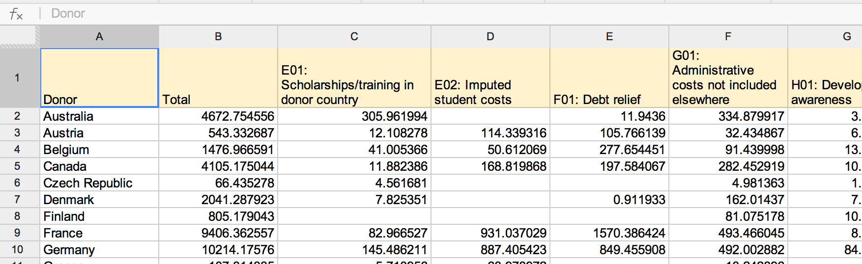
The data is a Google spreadsheet. It contains several sheets, but the main sheet looks something like this:
You can download this data from the Google Spreadsheet directly. Or you can download the data as an xlsx file I saved on 06-Mar-2014.
Assignment
Your task is to design two static (i.e., a simple image) visualizations that you believe effectively communicates the data respectively two aspects which seem to be important to you and provide a short write-up describing your design and one paragraph about the process you used to do the exploration and analysis. Did anything limit or frustrate you? If nothing did, perhaps there was something that was more difficult than you thought it should be.
As different visualizations can emphasize different aspects of a data set, you should document what aspects of the data you are attempting to most effectively communicate. In short, what story (or stories) are you trying to tell? Just as important, also note which aspects of the data might be obscured or down-played due to your visualization design.
In your write-up, you should provide a rigorous rationale for your design decisions. Document the visual encodings you used and why they are appropriate for the data. These decisions include the choice of visualization type, size, color, scale, and other visual elements, as well as the use of sorting or other data transformations. How do these decisions facilitate effective communication?
Understanding the data and designing the visualization may take some time. So plan accordingly. Also try to apply the design recommendations discussed in class and our readings.
Procedure and Submission
You may create the visualizations or a prototype of it by hand or in any tool you're already knowing, but you will have to use the provided data. Please submit a PDF-document containing- both of your visualizations
- your description and explanation
I will make the results accessible to all on the class web-pages.