Project Topics
I'd like it if you come up with your own ideas! However, if you'd like to get some ideas, there are possibilities of projects in the areas of:climate science (together with Niklas Röber, DKRZ, Hamburg)
The goal is the visualization of thermohaline circulation which is also known as the ocean conveyer belt. The task is finding it in a large data set and getting an idea what characteristics (speed, salt concentration, temperature, density) it might have in different parts of the ocean. The data set is a volumetric data set of size 800x400x50. You could use your own software to visualize it or some standard tools, like Avizo, ParaView, SimVis, Vapor, Visit. The key is finding the right transfer function! (download data, 2.3GB)
summary of algorithmic performances (together with Martin Polascheck)
The lecture on Algorithm and Data Structures includes an assignment in which each student has to implement a data structure for sorting. At the end of the course, it is possible to compare one's own results with everybody else. However, there is a large set of graphs that are being produced and one looses the overview very quickly. The task is to create an interactive program to create a better overview of all the data as well as good interaction techniques to quickly drill down into the relevant details a user would like to see. (download data, 365KB)
BioVis: (together with Peter Kerpedjiev and Ivo Hofacker)
1. Adding non-canonical interactions to secondary structure diagrams.
Simply adding extra links between nodes with various symbols indicating
non-canonical interactions. This would be a good away to learn about RNA
and RNA secondary / tertiary structure, d3.js and force-directed graphs.
example: 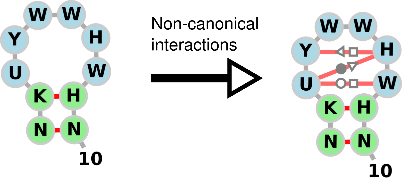
2. Rotation of subgraphs of force-directed graphs in d3.js. Not too difficult, a student could even make their own bl.ock example and apply it to RNA secondary structure diagrams. Example of dragging subgraphs can be found at the following link: http://emptypipes.org/2015/02/15/selectable-force-directed-graph/
3. Implementation of more complex RNA layout algorithms using d3.js. Good exercise in implementing a graph layout algorithm from a description in a classic paper by Bruccoleri and Heinrich: "An improved algorithm for nucleic acid secondary structure display".
Latex paper shortener
Latex is a very common document formatting language used for writing academic papers, grants, and reports. The default layout parameters of LaTeX result in very nicely formatted text but do not take into account final page length. Often one of the major limiting factors of these publications is page length. However, often papers are first written and refined without considering this limitation and then edited down to fit in the length requirement very close to the deadline. Because LaTeX's layout algorithm is somewhat unclear how it will adjust document length to changes in the source text and formatting paramters. Therefore, writers must resort to a long process of trial and error changing document content, adjusting formatting parameters, and recompiling the document in order to see if the document is within the page limits and still aesthetically acceptable. With some heuristics of document layout plus parameter space exploration and visualization of the final results it would be much clearer how the document will change this would allow multiple changes to be made at once and fewer recompilations. This process could be made much faster.
Goals
- identify heuristics useful for document layout
- lines with partial or only one word
- very long words/phrases with shorter synonyms
- spacing between paragraphs and sections is highly variable
- therefore changes at the end of the document probably will have more impact
- things like margins, line height, font sizes, etc are often fixed by the journal
- spacing within subfigures is often unspecified by the journal
- visually highlight where in the document changes could be made
- automatically experiment with different layout parameters within the constraints of the journal format
- could also treat some of the heuristics as "parameters"
- one word lines could simply be deleted and recomputed (user will have to fix grammar though)
- automatically try a bunch of synonyms for long words
- readability score is also a factor
Creating a debugger for programming a ray-tracer
The idea is to support your fellow students in the Computer Graphics class. One of the most difficult things here is to debug your code. One way to do this is to try a lot of different parameters in an efficient way. E.g. lots of different material parameters, different light intensities, different camera placements and so on. Imagine you had such a tool which would create lots of images with these different setting and quickly lets you browse through your results. Wouldn't that be great? Well, you could create one such tool!
Visualize Machine Learning algorithms
One of the difficulties with machine learning is to really understand how an algorithm works. The goal here would be to pick a particular one and help the user to better understand it by visualizing their behaviour. One way (but a promising way) is to expose their parameters and create lots of different results of the algorithms by varying these parameters. The summary of the results gives an overview of what this "black box" is capable of. Pick your favourite algorithm (SVM, clustering, Deep Learning, Neural networks, etc.) and develop such a tool.
Analysing Music Listening
Understanding the music landscape is difficult. How do you classify songs into groups of similarity? How do you describe and visualize songs and music libraries based on their various features? While there is a lot of research on understanding and analysing the audio signal, one could also look at other data such as online ratings, social music tags, music listening and purchase histories, reviews and forums, and many others. However, these two techniques are typically considered separate lines of research. To date, little work has tried to look at the intersection of these techniques.
Online music libraries are growing rapidly. Just recently there has been the curation of a large set of songs, known as the Million Song Dataset. The goal would be to analyse this dataset to understand things like popularity of songs, their similarities with regards to various features, their semantic qualities like mood and genre, and any other interesting insight that can be derived from the tons of data available online as well as the signal data of the song itself.
Overall goal: Create a visual analysis tool for the analysis of the Million Song Database. Let the user explore different aspects, such as simple statistics of the dataset as well groupings and correlations based on various features.
Resources:
- http://labrosa.ee.columbia.edu/millionsong/
- last.fm
- http://the.echonest.com/
- Raw Subset and Cleaned Subset
Data storage workload analysis with counter stacks (together with Coho Data, Vancouver, Canada)
Description: The recent advent of high-capacity flash has initiated a revolution in the design of data-center storage software and hardware. Modern designs use a hybrid approach, combining a high-performance flash tier with a high-capacity, much slower spinning disk tier. Effective designs of these hybrid storage systems require understanding how user workloads interact with the underlying system. Using the concept of workload locality is a powerful way to measure this interaction. The Counter Stack is a derived, low-space representation of a workload trace that preserves locality and provides useful measures of such as miss-ratio curves and histograms of the hotness and coldness of the underlying data stream.
Analysis tasks in computer storage are ripe for assistance from modern visualization tools. Any contributions your project can make to accelerating the task of understanding of a set of workloads will likely have high impact in this field.
Task ideas:
Task 1: Build interactive visualizations that provide a useful overview of the entire workload history in the system as well as having the facility to drill down into smaller time periods. Where are periods with lots of new data?
Task 2: Build a visualization to understand the temporal characteristics of miss-ratio curves over time. Do these curves exhibit periodic behavior? Are there periods of stability, in which the miss-ratio curve doesn't change much over time?
Task 3: Build a visualization to understand how workloads interact with each other over time. Given a set of workloads, is there one which "pollutes" the high-speed tier, pushing out useful data in the process? Is there an interactive way to schedule a set of workloads to reduce these interactions?
Info/Code/Data:
Background Information: A good visualization design for this project will require a high-level understanding of miss-ratio-curves and LRU caches. Below is a link to a paper and video and a presentation video describing the concepts necessary to building this understanding.
Code: A set of binaries and scripts for running queries against the counter stack database. These binaries are provided under a non-commercial license exclusive to the University of Vienna. They are accompanied by a API description for integrating the database into a project. Please see the instructor about getting this code.
Data: We will provide a counter-stack database derived from week-long set of storage workloads published by Microsoft Research.
Analyzing high-frequency trading data (together with Nikolaus Hautsch, Stats department)
High-frequency trading is becoming more and more dominant at stock exchanges. Understanding and analyzing the market of high-frequency trading is a hot research area in financial statistics. The overall goal of this project is to create a visual analysis tool that helps to explore a larger number of stocks and their trading behavior throughout a certain time frame.
The data: The basis of the analysis will be high-frequency trades as collected and distributed by the lobster web service. The data consists of a time stamp, event type, size of an order, price, as well as the type (buy or sell). Further, so called order books are available that register all ask and bid prices and volumes.
A selection of (basic) tasks: The overall challenge is in visually displaying the orderbooks for different / several stocks in order to
- create an overview of the market behavior
- enable filtering (and comparisons) according to price, volume, spread (difference between bid and ask), as well as transaction volumes
- compare, e.g. high-price stocks with low-price stocks
- gain an understanding of the market / market changes by exploring different time aggregations (from second intervals to 5min intervals)
- understand imbalance between bid and ask as well as accumulated bid and ask scenarios
- find outliers stocks or trade imbalances
Different higher-level goals:
- Downloading data from the Lobster account and visualizing orderbook dynamics on a high-frequency (time) resolution for a few stocks. This could be done on different aggregation levels (eg 1min vs 5min) and we could try to identify, for instance, periods of extreme buy-sell imbalances or periods where the orderbook becomes very deep or thin, respectively. One can also represent the orderbook in terms of implied transaction costs or roundtrip costs (more details can be aquired).
- Cross-section of 1min data can be provided. Using the cross-section of 1min data and visualizing how the cross-section of different variables (e.g., bid-ask spreads, orderbook volume up to a given level, implied transaction costs, volatility etc.) moves over time. It would be interesting whether there is some co-dependence between some variable and how this changes over time.
For the purposes of this project we can help you gain access to the lobster database.
Analyzing Citybike Data
Vienna’s bike-sharing program, Citybike, is becoming more and more popular every year. In 2014 there were nearly 1 million rides in Vienna. A well-developed network, with more than 120 stations in 18 districts, offers the possibility to use these bicycles as an alternative form of transport and for getting around.
The analysis of the recorded data has always been an important part of the daily work of the city bike operators. On the one hand this enables the identification and remedying of weak points and on the other hand they can make better decisions regarding the network expansion.
At the moment, balancing the different filling levels of the stations is one of the biggest challenges. The bikes are not spread evenly across the city and must be moved by the technicians between the stations every day. This is a costly and time-consuming process that needs to be optimized.
Data:
- Damage reports („Schadensmeldungen“)
- All driven routes
- Stations (timestamps of available bikes/boxes)
Overall goals:
- Build interactive visualizations which help to better understand the different aspects of Citybike Vienna
- Don’t place the main focus just on a single dataset. Combine them to get interesting insights.
Open Data
There has been a deluge of open data by various government and governmental organization over the last few years. While this is admirable, what good is all this data doing if the common citizen is not being able to understand, explore, nor learn from this data. Hence, the goal is to develop a tool (ideally) web based that helps people to explore such data. One of the challenges will be to gear this tool toward a broad set of people, hence you cannot assume a great visual literacy (a problem the New York times has been struggling with and perhaps is providing some ideas for). Further, it is unrealistic to provide a universal tool where all types of data can be explored with and all questions can be answered with. Hence, it'll be important to narrow your focus on specific aspect of civic life. There are quite a number of open data sources that you can choose from:
- Austria
- Open Government Data (OCG) -- data for Vienna and Austria.
- EuroStat -- data from the statistical office of the European Union.
- data.gov -- data from the US government.
- Plenty of other sources around the webby web.
- See section Open Data below for more links
IEEE Vis / BioVis contests
There is a visualization contest running right now which is on visualization of climate data. Further, BioVis is running a Data Contest as well as a Redesign Contest right now. Don't be afraid! Check it out and see what you can do. It'll be fun, and might get you a trip to Paris in November to attend the Visualization conference. I do believe these are doable for you!
... there may be others :)
Open Data
- United Nations Data
- OECD Statistics Center
- NationMaster and StateMaster statistics repositories
- The Sunlight Foundation maintains a list of resources for political transparency.
- Many-Eyes, site for public data and visualization
- Data360, yet another data sharing site
- CMU Statistical Data Repository
- NIST (National Institute for Standards and Technology) Scientific and Technical Databases
- Statistical Science Data Sets - Large index of data sets from fully processed to raw.
- The Journalists Database of Databases - A good collection of interesting data, mostly government, social, and economic.
Agriculture, Food and Nutrition
- World wine statistics - Information on worldwide wine production and consumption.
- USDA PLANTS Database - The PLANTS Database provides standardized information about the vascular plants, mosses, liverworts, hornworts, and lichens of the U.S. and its territories. It includes names, plant symbols, checklists, distributional data, species abstracts, characteristics, images, plant links, references, crop information, and automated tools.
Demographics
- Frequently occurring first and last names - U.S. Census Bureau genealogical data on names.
- Popular baby names - Social Security Administration data on distributions of given names.
- Human Mortality Database - The Human Mortality Database (HMD) was created to provide detailed mortality and population data to researchers, students, journalists, policy analysts, and others interested in the history of human longevity.
National Surveys of 8th Graders
A nationally representative sample of eighth-graders were first surveyed in the spring of 1988. A sample of these respondents were then resurveyed through four follow-ups in 1990, 1992, 1994, and 2000. On the questionnaire, students reported on a range of topics including: school, work, and home experiences; educational resources and support; the role in education of their parents and peers; neighborhood characteristics; educational and occupational aspirations; and other student perceptions. The .xls file contains 2000 records of students' responses to a variety of questions and at different points in time. The codebook explains the question and answer codes.Other
- Baseball Statistics - The Lahman baseball database, 1871-present.
- Google Trends - Track the average worldwide traffic of any search term. Once you get the results, scroll to the bottom of the page and look for "Export this page as a CSV file". You must be logged into Google for the feature to work
Politics and Government
Florida 2000 Ballot Data
This data set is Florida election data from the CMU Statistical Data Repository. (Note: when downloading these files, be sure to use the correct "save-file" operation for your browser ... IE tends to add extra characters that confused the programs.)U.S. House of Representatives Roll Call Data
This contains roll call data from the 108th House of Representatives: data about 1218 bills introduced in the House and how each of its 439 members voted on it. The data covers the years 2003 and 2004. The individual columns are a mix of information about the bills and about the legislators, so there's quite a bit of redundancy in the file for the sake of easier processing in Tableau.Government Spending Data
Have you ever wanted to find more information on government spending? Have you ever wondered where federal contracting dollars and grant awards go? Or perhaps you would just like to know, as a citizen, what the government is really doing with your money.Visualization Contest
For a number of years, the Vis, InfoVis, and VAST conferences have created a visualization contest. For each contest a problem scenario together with the relevant data sets have been provided to the research community and a price has been awarded to the best visualization. Some of the problems have been quite challenging. However, for the most part, these are great problems to work on. Have a look:- BioVis Data Contest 2015
- BioVis Design Contest 2015
- BioVis Data Contest 2014
- BioVis re-Design Contest 2014
- BioVis Data Contest 2013
- BioVis re-Design Challenge 2013
- SciVis Contest 2016
- SciVis Contest 2015
- SciVis Contest 2014
- Vis Contest 2013
- Vis Contest 2012
- Vis Contest 2011
- Vis Contest 2010
- Vis Contest 2009
- Vis Contest 2008
- Vis Contest 2006
- Vis Contest 2005
- Vis Contest 2004
- InfoVis Contest 2008
- InfoVis Contest 2007
- InfoVis Contest 2006
- InfoVis Contest 2005
- InfoVis Contest 2004
- InfoVis Contest 2003
- VAST Challenge 2015
- VAST Challenge 2014
- VAST Contest 2013
- VAST Contest 2012
- VAST Contest 2011
- VAST Contest 2010
- VAST Contest 2009
- VAST Contest 2008
- VAST Contest 2007
- VAST Contest 2006